Alter Eco
Consumer Packaged Goods
Brand Strategy, Packaging Design
Industry .
Expertise
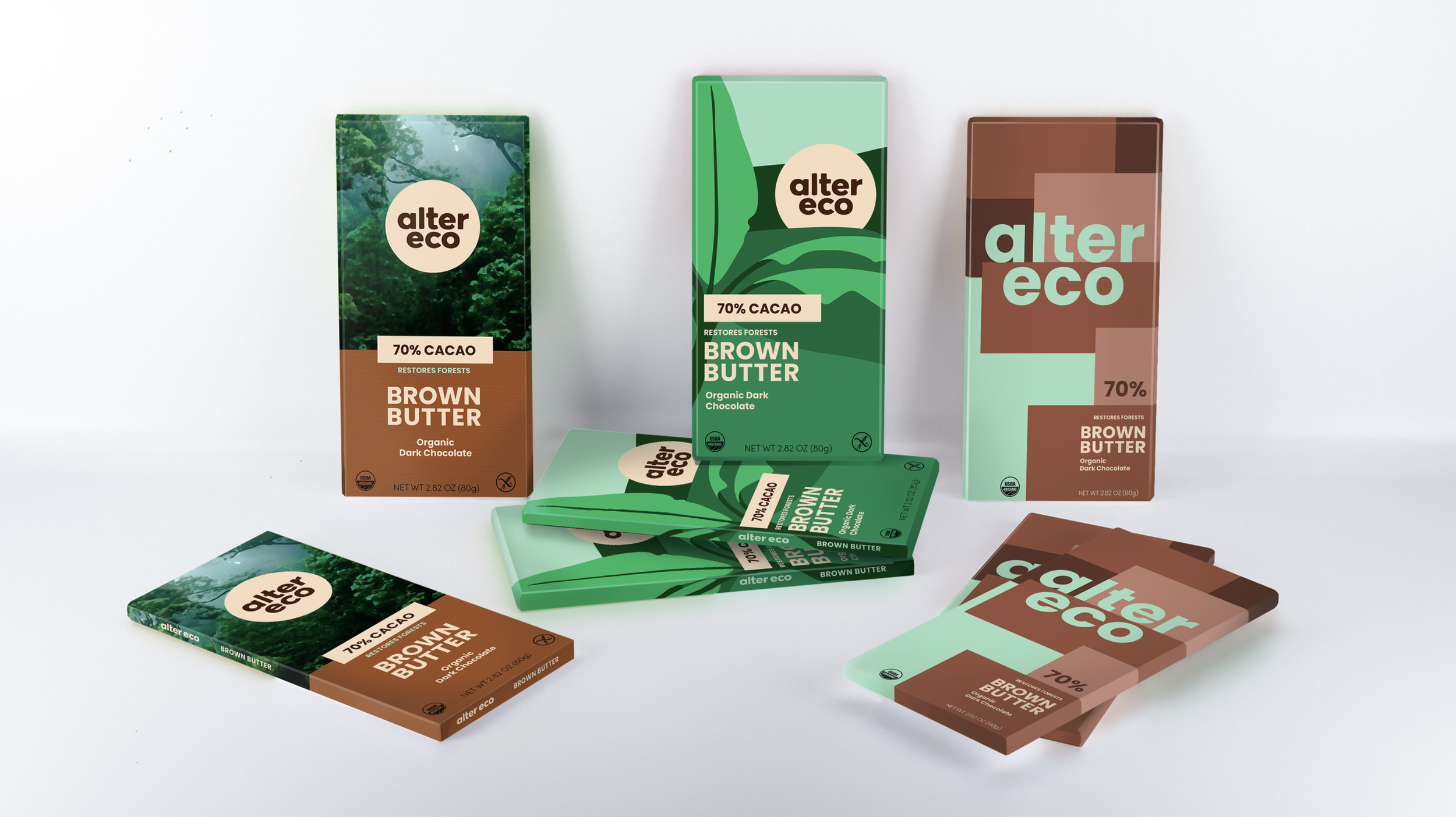
Exploring new expressions for conscious consumption. Three distinct packaging directions explore different ways the brand can be expressed, balancing clarity, storytelling, and shelf presence.
The Challenge: Evolve the packaging identity for Alter Eco’s dark chocolate line to more clearly communicate its values of fighting climate change and ethical cacao sourcing while maintaining brand continuity. The goal was to create a system that feels more focused, legible, and compelling in a competitive retail environment.
Methods: Conducted research into brand positioning, consumer behavior, and category dynamics, including an analysis of competitors and emerging visual trends within sustainable consumer goods. Insights were used to define key opportunity areas and inform the development of multiple design directions.
The Outcome: Developed three distinct packaging directions, each offering a different approach to brand expression, from refined continuity to more expressive transformation. Together, they establish a flexible foundation for future evolution, supporting sustainable brand growth.
ABOUT
Alter Eco is built on the belief that food can restore rather than deplete. By pairing high-quality, organic ingredients with small-scale, fair-trade farming practices, the brand delivers a premium chocolate experience while supporting farmer livelihoods and addressing climate and social inequities. As a carbon-neutral B Corporation, Alter Eco operates with transparency and a long-term perspective, positioning sustainability as a core driver of both product and brand.
EXISTING DESIGN
Alter Eco is committed to sustainability, advocacy, and quality, and they are dedicated to building a more holistic agricultural system that restores the Earth rather than depleting it. While their company mission resonated with me, I determined that their current design landscape was outdated and busy. In each of my proposals, I simplified the nutrition label to increase legibility and highlighted Alter Eco’s use of only five ingredients under the new headline “Just the Good Stuff”. In my design, I sought to modernize, streamline, and future-proof the company branding to attract new consumers and ensure that the Alter Eco mission can continue to create positive change for years to come.
NEW TARGET DEMOGRAPHIC

Through my market research and analysis, I determined that the current Alter Eco target demographic is too narrow. I proposed expanding the profile to include a broader range of age, race, and gender identity.
Meet Kai: Kai is a recent college graduate who lives in Boulder, Colorado. She is a working professional making $90,000 per year and is politically motivated and progressive. She spends as much time as she can in nature and cares about her impact on the environment as well as what she puts into her body.
Meet Flynn: Flynn is a project manager working in San Francisco, California. Mindfulness, health, and wellness are very important to Flynn, and they practice daily yoga and meditation. They also love journaling, reading, and painting, as well as hosting beachside socials with their friends.
Meet Flynn: Flynn is a project manager working in San Francisco, California. Mindfulness, health, and wellness are very important to Flynn, and they practice daily yoga and meditation. They also love journaling, reading, and painting, as well as hosting beachside socials with their friends.
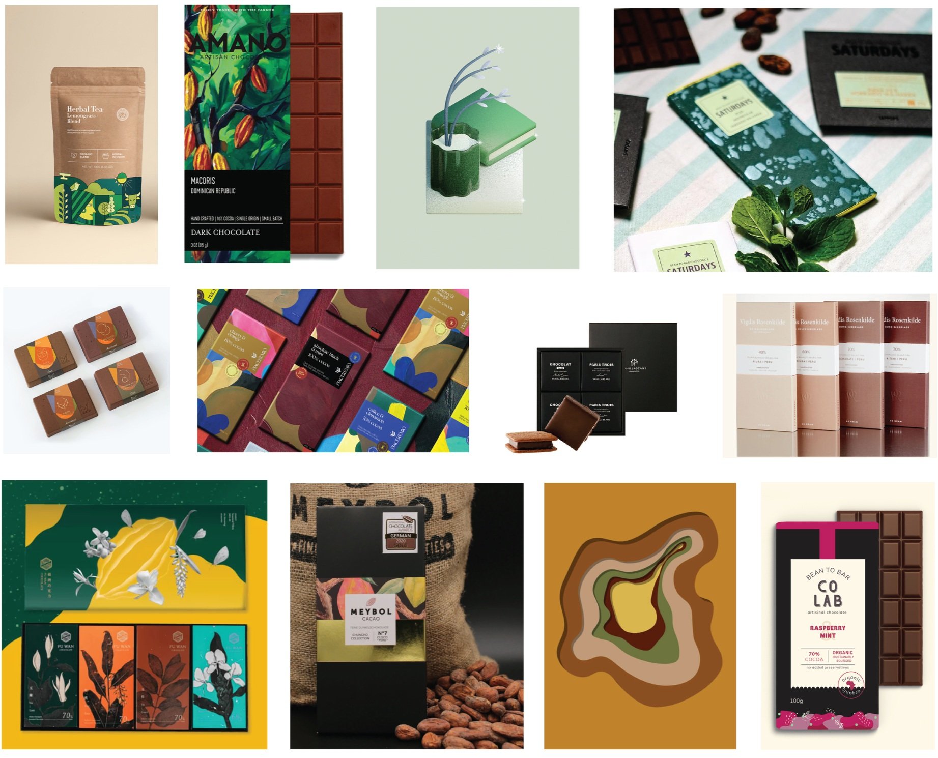
DESIGN VISION BOARD
PROPOSED GUIDELINES


ITERATION 1

REFINED CONTINUITY
For the first iteration, I wanted to create a version with minimal yet strategic change. To appeal to a more conservative client, this version remains very true to the original design, yet it has been shifted in key ways. I wanted the design to appear bolder, cleaner, and more sophisticated without losing a sense of playfulness and approachability.
ITERATION 2

NATURE-LED STORYTELLING
In the second iteration, I wanted to highlight the company’s green initiatives and close connection with the rainforest ecosystem. While the first iteration subtly shifted the photography towards a more illustrative style, here the illustration wraps around the entire package to create a holistic viewing experience. It also engages with the logo in a new way and simplifies the forest diagram on the inner label. The aesthetic of this layout is clear, fun, and striking - allowing it to stand out on the shelf while still clearly communicating its messaging.
ITERATION 3

BOLD GEOMETRIC REBRAND
The third and final iteration was the most dramatic departure from the original packaging. In this version, I pushed the design to create an ultramodern geometric layout formed by warm earth tones and sections of bright green for a striking pop of color. I changed the logo by selecting a more angular sans serif font and removed the surrounding circle to match the rectilinear background. The goal with this proposal was to create a bold approach that would clearly differentiate the Alter Eco product from other competitors in the market.